
In the past month, there has been a rash of articles about an award winning AuthaGraph World Map all of them touting how accurate it is.
Being a map projection hobbyist, I’d thought I’d weigh in with my thoughts. That’s what blogs are for right?
1. What a fun map!
I just want to say right from the get go that I really like this map. But what I like about it doesn’t have anything to do with whether it’s accurate or not.
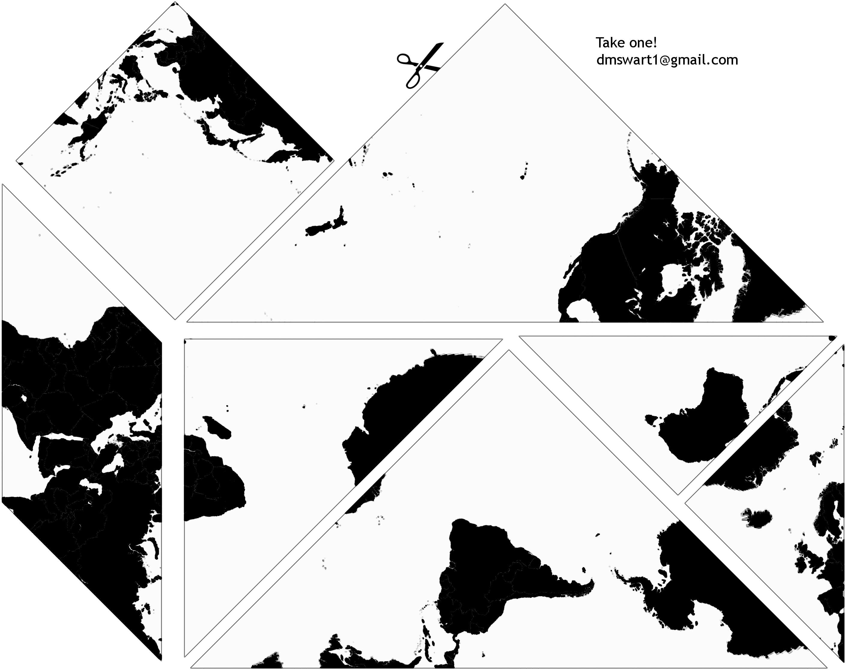
These articles gloss over the fun playful things this map is doing with mathematics. In particular, this map is tileable. Now, having a tileable map isn’t that new (Lee’s Tetrahedral projection for instance was developed in 1965), but this map encourages people to explore and play with the consequences of its tiling. The designers show us how we can cut up and reconfigure the world map to suit our layout purposes:
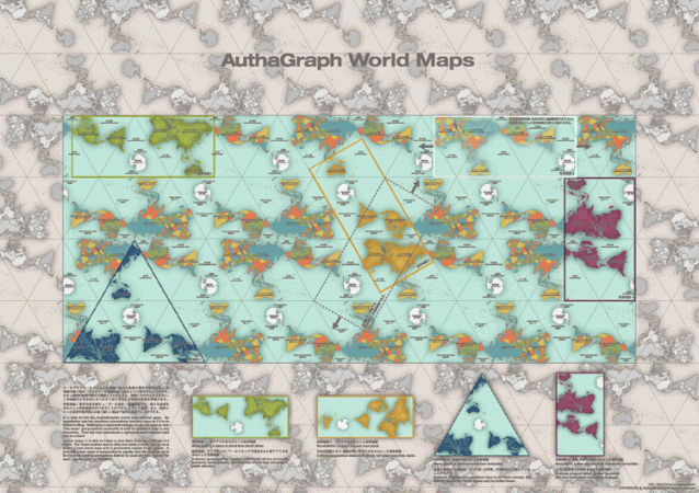
I’d like to see the Hobo-Dyer projection do that!
2. “Most accurate”?
News articles and blogs have called the AuthaGraph world map the “most accurate” one yet (as news articles and blogs often do). The problem with this is that maps are always going to be inaccurate one way or another. This is beyond dispute. It’s a direct result of a theorem by Gauss which says that you can’t map points from a sphere to a plane such that all distances are preserved.
So a map might perfectly represent area but it then it couldn’t keep its shapes from having a stretched out look. Or it might have well oriented cardinal directions (vertically and horizontally), but then it wouldn’t be able to show how a plane can fly in a straight line over the north pole.
So when you read “more accurate” or “most accurate” you have to ask “accurate in what sense?” You see, map projections are just mathematical functions (of the form f:S²→ℝ²). So saying “the Mercator sucks” is like saying hyperbolas suck. You need to qualify it: “hyperbolas suck at modelling trajectories.” okay. “Mercator sucks at representing area” sure.
So how about the AuthaGraph world map? It seems to be equal area, or close to it. But have a quick look at South America for instance. The shape is a little wonky, it seems too wide. I don’t have a problem with that, but I do have a problem with it being called accurate.
3. Fact-check
This being 2016, I thought it’d be appropriate to do some fact-checking of this map’s news coverage. I’ve pulled some statements from the recent articles and rated them on how true the claims are.
- this wacky world map: Sure ‘wacky’ is an entirely subjective term, but just look at the way the cardinal directions flip around, and the way maps boundaries resist being treated as the edge of the world, but are shown as the arbitrary lines on a continuous surface that they are. TRUE.
- what’s possibly the most proportional map we’ve ever seen: I really don’t know how many maps the writer has seen, or what exactly they mean by ‘proportional’ but come on. FALSE.
- the most accurate map ever produced: Come on. FALSE.
- a more accurate map: any map is almost always going to be more accurate in some way than some other map. For example, when it comes to equal area, almost every map is more accurate than the Gnomonic projection (whose distortion is so great can’t even represent the other side of the globe) So of course ‘more accurate’ is TRUE. It’s just not saying much.
- A world map that doesn’t lie: is another way to say there are no distortions. I.e., practically perfect in every way. They’re thinking of Mary Poppins. FALSE.
- Maps can’t accurately depict the earth’s curved surface. But this one comes close: Kudos to Elizabeth Koh and/or her headline writer, this is exactly in line with how I feel about this map. SUPER TRUE.
4. Do try this at home
I imagine that if you’ve read this far, you are probably excited enough about the map to consider buying one. But maybe you don’t want to pay for the shipping or you’re waiting for your package to arrive in the mail. Take heart, you can get started with some map fun right now!
Like I said, one of the cool things about the AuthaGraph World Map is the way it tiles and can be reconfigured. Here is a set of Tangram puzzle pieces that I designed with the world map that you print, cut out, and rearrange yourself! You have permission to download individual copies for personal (non-commercial) use:

Or maybe it’s the way the AuthaGraph World Map folds into a paper globe that has you intrigued. I have a couple of papercraft globe projects from a paper entitled Papercraft Panoramas. You can read the paper, and then download the supplemental material for some patterns to print out. With some patience, you can have your very own papercraft heart-globe.

5. To sum up
So yeah – I really like this map, although I’m not so hung up on whether it’s accurate or not. Accurate schmacurate. But look at that tiling! Look at the cool ways you can reconfigure and cut out the map! What fun!

Hello, Thanks for sharing. It is very interesting.
Could you please help me get the “supplemental material“. I can not open this link.
Thanks.
Connie
conniecji@gmail.com
LikeLike
Hi Connie,
I have a couple ideas
1. you can navigate to the main page of the paper and click on the Button that says “Supplement 1” Maybe that will work.
https://archive.bridgesmathart.org/2013/bridges2013-411.html
2. Sometimes the browser would take a little bit of time, so just wait for 10 or so seconds and maybe the file will pop up in your downloads folder.
3. sometimes the browser is extra suspicious of downloaded files, I know in my browser (chrome) I had to click “allow” before it saved my .zip files.
Hope this helps
LikeLike
Thank you, Mr. Swart. I got them.
Blessings,
LikeLike