
On October 28, I gave a TEDx talk at TEDxUW 2017. A transcript and some slides from my prepared (as opposed to delivered) talk is below.
The experience was fantastic. The organizers did a great job putting on the event. I especially found the time we (us speakers) spent with the speaking coaches (Speaker Labs‘ Eric and Eli) very valuable.
And here’s a link to the video which was posted March 2018.
[Ahem]
I love oranges. They’re sweet. It’s the best of all the juices.

As a mathematician, I love oranges because they’re spheres, and you can peel them in one piece and flatten them on the table to make interesting geometric shapes like this five pointed star or this elegant spiral. If you put them together you can even make a cool flower design.

As an artist, I love oranges because of how these elegant curves and organic forms emerge from what is essentially a featureless sphere.
There’s a field of study that does this. Cartography. Instead of oranges, cartographers use mathematics to peel the globe into a flat worldmap. There’s a special word for the different ways to flatten the globe. They’re called ‘projections’. And projections are fascinating.
Here are three of them. It’s a mathematical fact that there are no perfect projections. Every projection must have some sort of distortion or inaccuracy. And so cartographers are always coming up with ways to minimize one type of distortion or another, or make compromises between them. This has led to the wide variety of map projections that we see today.
I thought it would be a cool idea to make my own map projection based on this orange peel design. So I did.

And I think it turned out pretty good. So I posted it online. And I got some comments back.
“Isn’t it kind of odd to have two copies of the world in one map?” … I mean I guess so …
Another comment was “Cartographer here -” (I love that. On the internet, when you want to speak with authority, you say you’re ‘here’) – “Cartographer here, I’ve never used an orange peel projection. I don’t know anybody who has”.
At first I allowed myself to think. “oh he’s right. What am I doing, I’m wasting my time”. But then I thought, “No. This was awesome. I had fun doing this. Who cares if no one has used this before”.
It made me realize how ingrained it is in all of us to see things in terms of practicality and utility. It’s like we have these utilitarian goggles on. But these goggles make us blind to some pretty fascinating things.
I’ll show you what I mean. Here are some of my favourite projections. They’re in the miscellaneous section at the back of projection books. Kinda like the cool misfits hanging out in the back of the classroom. But beside each of these projections is a little note that says “novelty projection” as if these were mere curiosities. That’s kind of annoying. Because look how cool these are.
The Werner projection is shaped like a heart. That would be perfect for valentines day. “You mean the world to me, sweetie.”

And the Guyou projection can tile your wall like wall paper. I’d like to see the Winkel Tripel projection do that! But no they are ‘to be dismissed as novelties’.

And then I saw this projection. The Berghaus star projection. The note beside this one said “for artistic purposes”. YES, finally! Someone had taken off their utilitarian goggles long enough to realize that you can do these things because it’s interesting, or beautiful, – for art’s sake.

And that’s what I want to talk about today. I want to talk about map projections but from a creative point of view.
Now, you can’t have a talk about map projections without talking about the Mercator projection. It’s infamous. It get’s picked on for misrepresenting area. It shows Greenland the size of Africa, when actually Greenland is the size of Saudi Arabia. That’s because the closer you zoom into the poles the more the Mercator projection zooms in.

Most people would have abandoned the Mercator projection in search of a more suitable projection. But we can stick around a little longer. I want to know how close can I get to the pole. How much will the Mercator projection zoom in. Let’s find out.

You thought Greenland was big, look at Antarctica.
Here’s the Amundson-Scott science station just a few meters from the south pole. I want to give a shout out to any south pole scientists who might be watching.
Let’s keep going. Now we’re only millimeters from the south pole. That backgammon board shape that you see is actually the snowflake at the south pole with all six arms pointing northward. And we could keep going.
Why didn’t anybody tell me that the Mercator projection goes forever? It’s because that wouldn’t be useful. That’s why.
If I wanted to be useful, here’s what would happen. If I was to make a useful projection I would start with some rules.
- Let’s make north and south vertical and east and west horizontal. I think that would be useful.
- Let’s fix that problem with the Mercator projection. let’s make it equal area so that every pixel in the map corresponds to the same number of square kilometers in real life.
With just these two rules we get one of the most unimaginative corners of cartography. The family of equal area cylindrical projections. Where the only thing you get to change is the width. Imagine if you were an artist doing a painting and the only freedom you had was to choose the size of the canvas.

Still that didn’t stop a progression of many named projections over the years where the only thing that changes is the width. Even in 2002 the Hobo Dyer projection was commissioned. That’s right, money changed hands and then they named it after themselves. I don’t get it.
So maybe this is your opportunity to have a projection named after you. Pick a number, it can even be one that’s been used before, the other’s will just have to share. Scale your map to that width. Put your name on it. Fame and fortune could be yours.
But for me that’s not very satisfying. What is satisfying is coming up with my own projections. Here are two gorgeous projections. And when I say gorgeous, that’s not me bragging. That’s the underlying mathematics that’s beautiful. I just put in the equations in to my program and I see what comes out.

Like any good artist – like any good mathematician – I asked myself, ‘what else can I do’. Well, I don’t have to limit myself to mapping the surface of a globe. I can map the surface of any sphere. Like a soccerball or a baseball.

Or spherical panoramas. Spherical panoramas are those all-around panoramas, not just 360 degrees, but up and down too. Like google street view or virtual reality. That’s a sphere of imagery so we can apply projections on them too.

What I like about projecting panoramas is that it’s a way to personalize things and add meaning.
This is the tree at my mom and dad’s house where I grew up. and beside it are my two sons when they were toddlers. For me it gives me a sense of stability and permanence even as time marches on.
And this one is a panorama of a bygone local landmark. The beloved Seagram barrel pyramid.
(I have to warn the people in the front row, the next sentence or two has a lot of ‘p’-words and I might spit on you – it can’t be helped). This is an appropriate panorama for this projection because this projection is based on a pyramid, and the panorama is based on a pyramid. A pyramid is a polyhedron. I want to show you how you can base a projection off of a polyhedron in order to project panoramas. (whew).
Here’s how. Start with your favourite polyhedron. I have the pentagonal hexecontahedron, the rhombic dodecahedron, and the deltoidal icosatetrahedron. Don’t be too afraid of these names, they’re no more difficult than Pokemon names.
The next thing you do is you inflate them like a balloon into spherical versions of themselves. Now you have a sphere where you can cut along the edges and flatten them into panoramas like so.
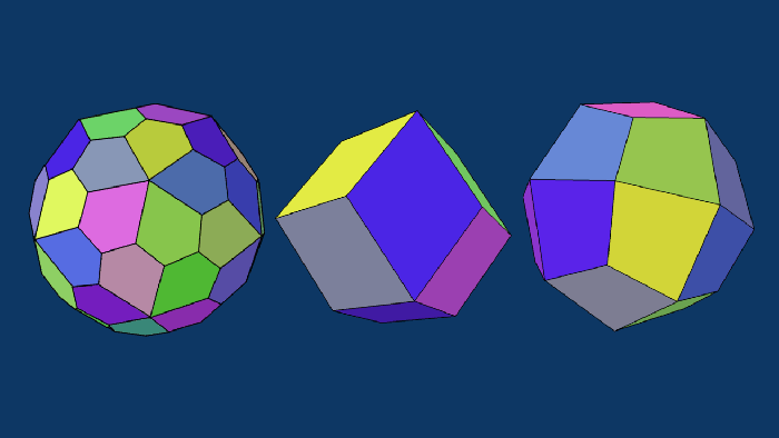
I like to think that when I make a projection based off of a polyhedron it’s my way of collecting it like a Pokemon.

I can also make projections based off of sports balls. This soccerball has these amazing pinwheels that are beautiful. And this last one. Well this last one just looks like a basketball exploded.

Okay these projections are me just going crazy. They’re so intricate that you can’t really make out the spherical content. Really these are just explorations of the spirals and squiggles and spherical symmetries that you get when peeling a sphere.

this is the thing about mathematical art. On the Art side I get a sense that I’m creating something, that these are shapes that are coming from my brain. But on the mathematical side, I also get a sense that I’m discovering some underlying mathematical truth, that’s just waiting there to be discovered. And I’m certain that if anyone else started playing with peeling spheres games, they could very well discover these same patterns.
Up til now, I’ve shown you equations and algorithms and pixels. This last project I wanted to show you I wanted to make something physical.
I started with this projection. A nice three armed squiggle. And a friend told me it looked like a frog. So I drew a frog on it.

And then I used this design to make a woodcut print. Woodcut printing is a block printing technique mastered by my hero the Dutch graphic artist M. C. Escher. It’s where you take a block of wood and carve an image onto it. Then you ink it and print the image onto paper.
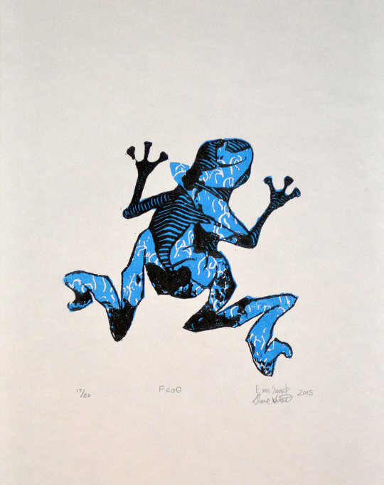
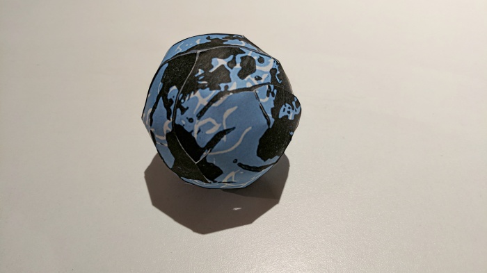
So my son and I carved two blocks, one blue and one black and printed this. Now what I like about this is that it rewards the viewer for a closer look. I like things that do that. So maybe someone would look at this and say, ‘oh nice frog’. Wait a second, that spot kind of looks like Africa. And then maybe after a while they might realize that if you were to cut this out, and maybe tuck in an arm or two, that you could indeed assemble it back into a paper globe.
Whenever you’re in a creative mood. Let’s say you’re crocheting, making a sculpture or a ship in a bottle. And you hear a voice in the back of your head “oh this is a waste of time”. Or you hear that back-handed compliment: “Someone has too much time on their hands”. (As if they didn’t just binge watch a season of Game of Thrones.) I want you to give yourself permission to take those utilitarian goggles off and do something in the name of a craft, or a hobby, or for art’s sake. I promise you you’ll be surprised and delighted.
It’ll be awesome.

The very spirally ones would be interesting for a papercraft before/after weaving thing.
LikeLike
Of course. I mean, in a sense that’s what the final photo here is: a papercraft of a squiggly map. For more examples of these projections physically realized as papercraft, have a look at a paper I wrote:
Click to access bridges2013-411.pdf
and a photo gallery of my other papercraft projects in this flickr album:
LikeLike